Congratulations.
You’ve made the important decision to bring your website out of the past and transform it into something that better reflects your brand, makes the boss happy, and knocks the socks off your visitors.
The good news is that you have the opportunity to create something that is beautiful, memorable, and functional. The challenge is that there are lots of options these days, and it is easy to get overwhelmed.
Fear not. This post is the first in a series on how to approach the visual aesthetic for your brand online.
Set the Vision: Brand Standards
What do you think of when you hear the word Chipotle?
I’m guessing it’s not just a pepper plant. If you’re like me, you think of barbacoa and sour cream and salty tortilla chips, too. But after that, what do you “see” in your mind?
- Can you envision the restaurant chain’s logo?
- Can you picture their maroon menus and foil-wrapped burritos?
- How about black-and-white photography hanging on the walls?
- The corrugated metal panels, plywood table tops, and exposed lighting?
Chipotle has done an incredible job branding every element, from their menu to the stickers they use on their drink fountains when they are out of order.

Brand standards are a set of visual assets that help maintain consistency across all of the places people may come into contact with your brand – both online and off. At 30 Lines, we start with brand standards to clearly define what we can and can’t do from a design standpoint. Those constraints actually allow us to be more creative and consistent on the websites, emails, and social media platforms we touch.
1. Colors
- Color Scheme Designer (below) – Starting from scratch? Only have one primary brand color? The Color Scheme Designer is a great way to expand and refine your new website’s color palette. The real magic lies in the “Adjust Scheme” tab at the bottom, where you can adjust settings like saturation and lightness. Once you’re satisfied, hover over any of the swatches on the screen to grab their hex codes.
- ColorPicker.com – Already have a palette picked out? Need to make modifications on the fly? ColorPicker.com is my go-to site as I adjust on-page CSS. Most colors on the web use a hex code (#BA1F00, for example), so having a tool that can quickly convert RGB values from Photoshop into a web-ready format saves a lot of time.
- Pantone Color Converter – Have a print designer who doesn’t quite speak “web”? Use this handy Pantone-to-Hex converter to get what you need. (Just be sure to explain that the reason the web version of Bright Chartreuse Pantone 14-0445 doesn’t match her swatch is because every screen is different.)

2. Fonts
Arial. Times New Roman. Comic Sans.
All fine font options… in 1994. But baby, how fonts have grown.
Much has changed in the past 20 years – both online and off. As a result, web designers now have a much wider range of options at their disposal.
For example, the font you’re currently reading is Cabin, an open-source web font from Google. It’s a sans-serif font (like Arial), but it has a bit more personality and style. It has also been optimized for legibility on screens and it is compatible across devices, like desktop computers, tablets and mobile phones.
Until a few years ago, designers would pick fancy offline fonts, and web designers would have to scramble to find a web alternative that was a close match. Today, many of the most popular offline fonts have web versions. Cohesiveness and consistency start with web fonts.

If your design firm is creating a new identity package or style guide for you, there is no reason NOT to choose a web-safe font as the starting point for your brand. Google Fonts alone has 637 free font families to choose from, and there are some 17,000+ paid options on MyFonts.com.
Design Resource
Creating offline assets like Photoshop files with web-based fonts used to be a challenge. Designers would have to search for, find, and download the zip file for each font to physically install on their computer.
SkyFonts is a tool that designers can use to pull entire libraries of web fonts onto their computers (to use during the design phase) without the need to download and install individual font sets ad hoc.
3. Textures
Like many visual disciplines, web design changes quickly and often follows trends. At the time of this post, parallax scrolling, animated backgrounds (see below), and abstract backgrounds are en vogue.
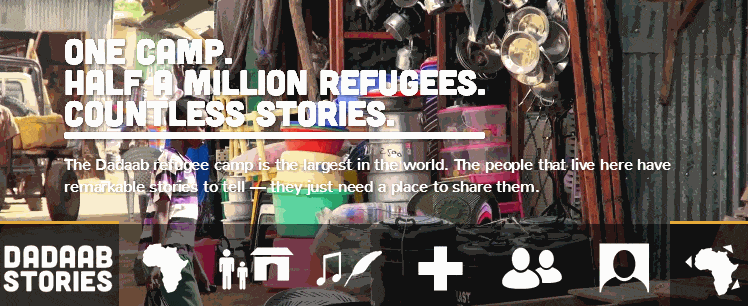
Background video on the homepage of DadaabStories.org
Each of these trends are, in my opinion, an iteration on a specific element that shapes the overall impression of your website: texture.
Too much texture, and your design can quickly become heavy-handed and appear dated. At the other end of the spectrum, designs that are composed solely of solid colors and fonts without shadows are knows as flat designs.
There is no right or wrong answer. Typically, our clients end up somewhere in the middle, with something that adds a little visual depth without being distracting, and still ties back to overall brand standards.

One of the hundreds of repeatable patterns from SubtlePatterns.com
- Subtle Patterns – Subtle Patterns is a free library of repeatable patterns to use in your designs.
4. Images
As someone with a design background, the current trend toward making the web more visual makes me happy. But when you consider the science behind it, it’s a wonder why it has taken so long in the first place.
According to some studies, vision accounts for between 30 and 50% of our brain’s processes at any given moment. Compare that to other senses like touch and hearing – which make up 8% and 3%, respectively – and it is apparent why a good looking website is so important to making a good first impression on your visitors.
Beyond the brain’s biological need to search for and analyze beautiful things, there are also informational advantages to making your websites more visual as well. Take the graphic below, for example.

From “Infographics and the Science of Visual Communication” on SocialMediaExplorer.com
When we look at an analog clock, our mind is quickly able to determine what time it is (3:25) by processing all of the information at once through simultaneous processing.
In contrast, if we were to read that same information as text (“Twenty-five minutes after three o’clock”), the brain is forced to move sequentially, left-to-right, one word at a time.
The Takeaway: Show, don’t tell.
Rather than describing what your newest product or apartment community looks like through three paragraphs of text, show it through multiple photos and let the visitor come to their own conclusion.
Photos & Branding

Royalty-free images from Death to the Stock Photo, LittleVisuals.co, IMCreator.com, and PicJumbo (starting at top-left, moving clockwise)
It’s no accident that I’ve saved the most important element for last. From a branding standpoint, the images and photos you use – or don’t use – will absolutely make or break a site. The way a site looks is the first and last impression visitors experience on your website. And based on how the brain interprets visual information (see above), that impression can mean the difference between deciding to purchase through you and moving on to the next result in their Google search.
That’s why it is always surprising that gathering high-quality photos of products or locations is an afterthought in the web design process. If you are presumably spending thousands of dollars building a brand new site that exudes your brand and vision, don’t skimp on the photography budget. You will end up with an expensive text-based site that no one remembers.
In most markets, local photographers are available to shoot high-quality, custom photos of your product or service on-site in a couple hours for just a few hundred bucks.
From there, supplement any gaps you have with high-quality, royalty-free images. “Stock photos” has now become a dirty phrase and alludes to businessmen in suits shaking hands. Better alternatives are becoming the norm. Below is a list of our favorite sites that allow their images to be used on commercial projects like corporate websites, print collateral, and more.
In Closing
A lot goes into making a website shine. There’s no secret sauce, no “one thing” that you can do to ensure its success. But by following the basic outline above, you can at least increase the chances that your designer will be able to create something that is visually appealing to the visitors who frequent your site.
