
Today’s the day. Even the mainstream media is going so far as calling it “Mobilegeddon.”
Back in February, Google announced changes designed to help users discover mobile-friendly content. As more web traffic moves to phones and tablets (and soon wearables?), it only makes sense that Google would favor websites that deliver a better small-screen experience. According to the announcement, those changes take effect today, April 21st.
The bottom line is that Google is going to start using “mobile-friendliness” as a ranking factor. If your website isn’t mobile-friendly, your ranking may drop in the search results, especially when people are searching for you from their mobile devices.
Lots of reputable sources have already written about the potential impact of this increased focus on mobile, including Search Engine Land and Moz.
If you’re concerned about your site’s mobile-friendliness, you can do a quick test here:
https://www.google.com/webmasters/tools/mobile-friendly/
But it’s important to note that even if your site is optimized for mobile viewing, it’s not necessarily optimized for mobile business.
Go ahead … take out your phone, and pull up your website in the browser.
Ask yourself these five questions about your site:
- Is your contact info easy to find? At a minimum, this includes your phone number, contact forms, office hours, and address.
- Is click-to-call enabled on phone numbers? Make sure your phone number shows up as clickable text, not text in an image (that isn’t easily read by search engines). Here are Google’s recommendations for implementing click-to-call on your website.
- Is your content organized in a way that makes sense for small screens? Responsive design is awesome, but simply stacking your content can lead to jumbled content and a confusing user experience. Make sure your content breaks down in such a way that the most important information for the customer is prominent and displays nicely, even on a small screen.
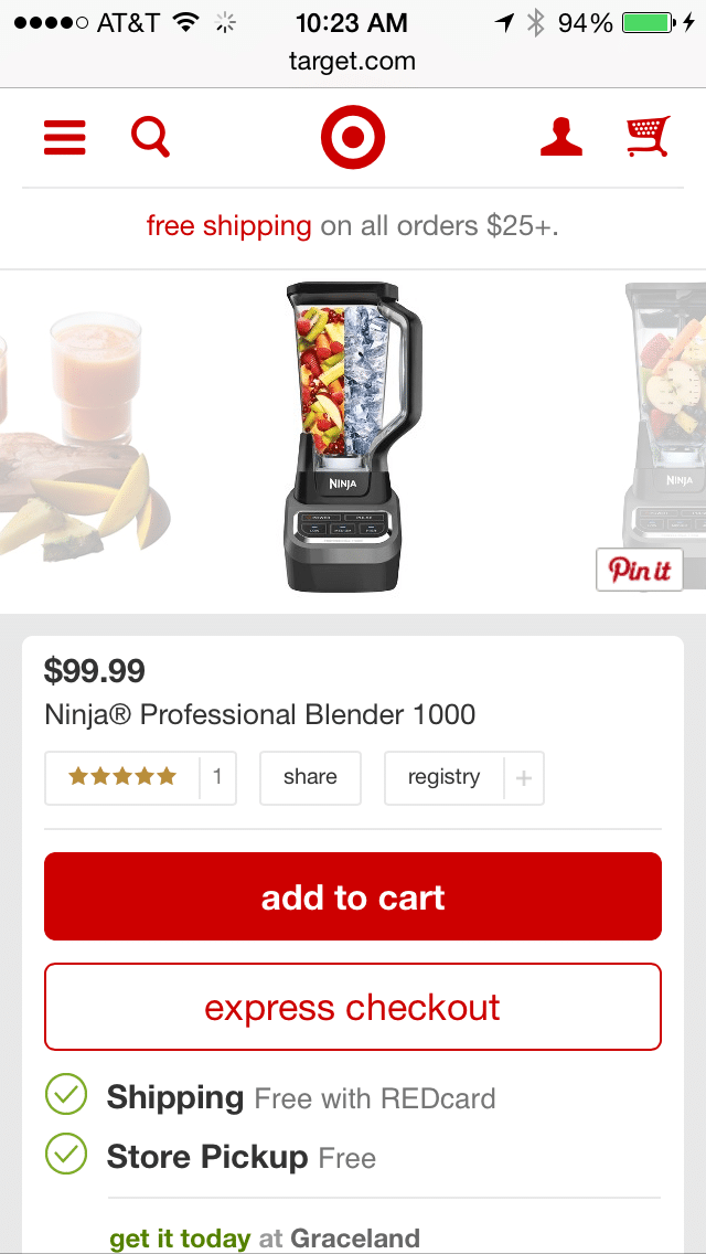
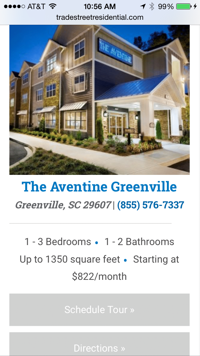
- Is your call to action clear and does it make sense for a mobile device? If you have pages with a lot of content and scrolling, do you need to repeat your CTA as the reader scrolls down the page? Should you anchor a phone icon or contact button somewhere on the screen? Some potential mobile-friendly calls to action include click-to-call, a store locator, links to get directions, simple email collection forms, and sharing options.
Mobile-optimized calls to action should match the actions you want your customers to take:
- Are your forms overly tedious? See the previous point; your website experience on mobile should be quick and easy. (Your prospect isn’t going to want to spend a half hour filling out an application with their thumbs. Consider collecting just a prospect’s name and email, then building out a more complete profile later)
Yes, Google is officially using mobile-friendliness as a ranking factor for search results. But really, that’s just the bare minimum you should be providing to your customers.
Your website is your company’s online storefront. Think of your website layout just like merchandising your store — organizing things in the right places will improve your results. And merchandising is that much more important when you have limited real estate to work with … like on a mobile device.
When you provide an online experience that’s just as thoughtful as the experience you offer at your physical location, it’s just good business.
If you have any questions about mobile-optimized websites and mobile SEO and what they mean for your business, send us a message.

It’s also worth mentioning page load time for mobile devices. Making use of breakpoints for different size “hero images”, minimizing js or css, or even creative, collapsible navigation that are intuitive to the user can help make or break conversions. The way I see it, you got about 2-3 seconds these days to capture the user’s attention and get them on the way to where they want to go. I suppose this information is more geared towards the technical side of things and really not meant for a business audience, but nonetheless, it helps.
Great post, definitely learned some things.