Responsive web design has made its way past buzzword status. In fact, it’s been more than a buzzword for a few years now. So how exactly does it affect you and why should you care?
The Long and Short of It
When using responsive web design, it is important to remember what the implementation won’t do. If you have a content creation problem, responsive design will not fix this. If you have server issues or slow response times, responsive design will not fix this.
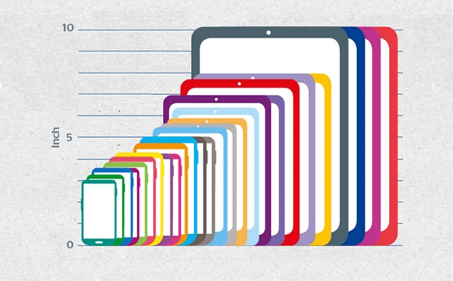
At the end of the day, responsive design is meant to help deliver a great user experience to every possible user across any device. The image below shows the different sizes of Android devices alone. Just think of how many screen sizes might view your site!

Android devices and their screen size difference.
To drop some stat bombs on you… Mobify put together a great list of 13 mobile stats from 2013. The statistic that really jumps out at me is that “over 1.2 billion people access the web from their mobile devices.” That’s a lot of folks looking at all sorts of screen sizes. If you weren’t aware of all the different device sizes, here’s a small grouping:

A small sampling of screen sizes.
When you think about your website, how would it look on each of those screens? With responsive web design, you can get your message to all users on all devices, and control the look of your site across the spectrum. Sounds pretty great, right? It is. But it also comes with some responsibility (akin to Uncle Ben’s words of wisdom in “Spiderman”).
Below, I’ve outlined what I consider best practices when implementing responsive web design.
Markup
At its core, your site is built with HTML/CSS. The HTML portion requires almost no changes for getting to a responsive state. The only snippet that needs to be added to your HTML is below:
<meta name="viewport" content="width=device-width, initial-scale=1.0" />
That meta tag goes in the <head> where your title tags and descriptions lay, and sets your viewport width to the width of your device, making it easy to set breakpoints in your CSS. A breakpoint in CSS is a pixel-width where your page layout breaks or doesn’t look right anymore.
You can generally tell where a breakpoint is by squishing your browser widthwise until something gets out of place. If this is over your head, then no need to get hung up on details. Let’s get to the magic part!
Setting Up Your CSS
You may be wondering what a media query is, and that’s totally understandable. It’s a pretty old technology in terms of when it was first used. If you’ve ever printed a web page, you might see that the printing format is very different from what you see on the screen, thanks to the @media query in the page’s CSS.
@media print {

	body { width: 100% !important; margin: 0 !important; padding: 0 !important; line-height: 1.4; word-spacing: 1.1pt; letter-spacing: 0.2pt; font-family: Garamond,"Times New Roman", serif; color: #000; background: none; font-size: 12pt; }
	h1,h2,h3,h4,h5,h6 { font-family: Helvetica, Arial, sans-serif; }
	/* other styles... */
	tr { page-break-inside: avoid; }
	a { text-decoration: none; color: black; }

} /* END print media */
The @media tells the browser, “Hey, if someone is printing this page, use this CSS.” That way, you aren’t wasting valuable ink on a neon green background. Playing off the @media query, we now have the ability through CSS to query any of the following items:
- ‘all’ – any media type
- ’aural’ – for speech and sound synthesizers
- ‘braille’ – for braille tactile feedback devices
- ’embossed’ – for paged braille printers.
- ‘handheld’ – for handheld devices
- ‘print’ – for paged material
- ‘projection’ – for projected presentations
- ‘screen’ – for color computer screens
- ‘tty’ – for media using a fixed-pitch character grid
- ‘tv’ – for television-type devices
From: Mozilla Developer Network
We’ll mainly talk about ‘screen’ for these examples, but know that there are many different queries you could use.
Great, we can query ‘@media screen.’ But then what? What about our small screens? Thankfully, there are several @media features that you can add to your query.
- width
- height
- device-width
- device-height
- orientation
- aspect-ratio
- device-aspect-ratio
- color
- color-index
- monochrome
- resolution
- scan
- grid
This list may be a bit daunting, but have no fear. You don’t need to use all of them. You could add one media query as simple as:
@media screen and (orientation:portrait) { … }
The above query tells the browser, “Hey guy, when the screen is in portrait mode, use this CSS.” Inversely, you could use:
@media screen and (orientation:landscape) { … }
If the screen is in landscape mode, use the CSS in this query. Landscape could be helpful for keeping things “above the fold,” no matter the orientation of the device. Looking around the web, a majority of the media queries used to serve different layouts come from something like this query:
@media screen and (min-width: 400px) and (max-width: 700px) { … }
When the screen has a minimum width of 400 pixels and a maximum width of 700 pixels, use this CSS. (480 and 600 are two common device sizes in that range.) Any device size in between will serve the CSS within the media query allowing you to adjust floats, clears, widths, padding, font-sizes, etc.
That’s a lot to take in, but hopefully it gives you an idea of all the different ways you can adjust your site to any device with responsive design. The next post in this series will take a look at handling images in a responsive site.


Trackbacks/Pingbacks